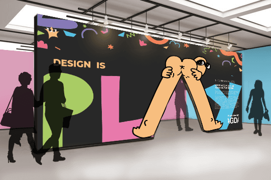
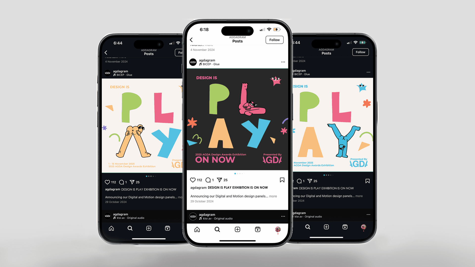
Design Is Play
Design Is Play is a branding project that reflects my bold, risk-taking approach to design that enables myself to create memorable and engaging works. In response to a brief for the AGDA Design Awards to complete the prompt “Design is…”, I chose “Play” as a concept to explore and push further.
This identity captures how I use creativity and humour to "cut through the noise" and spark curiosity and engagement with audiences.
I developed a custom typeface named Exhibitionist to explore how “play” could represent light-hearted creativity and frivolity. The font features a central, naked “character” that contorts its body to represent letters of the alphabet. The combination of its risqué poses, deadpan expression and simple, cartoonish linearity of the typeface becomes an “implementation of elements associated with play and fun”, embodying the principles of Playful Design (Jordan, 2021). Exhibitionist, as a Decorative typeface, becomes a tool to “give character to headings” (Barnum et al., 2012, p.124). Conversely, Semiotics, colour and imagery are used concurrently to reinforce how play is fundamental to self-discovery and learning. By applying Semiotics and establishing a visual Index, the imagery evokes whimsical, imaginative exploration, enabling the final Identity to communicate both the fun and intellectually rigorous aspects of design.